Inspired Artist: Rosa de Jong
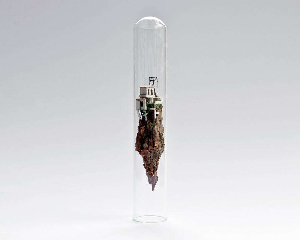
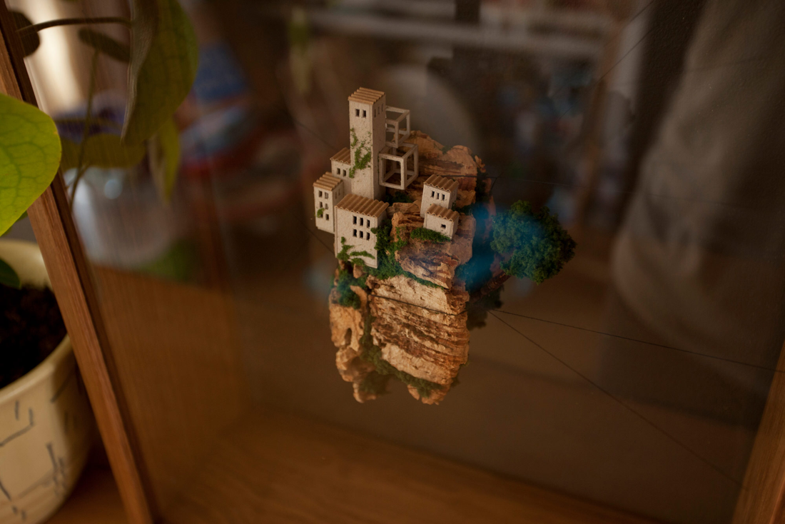
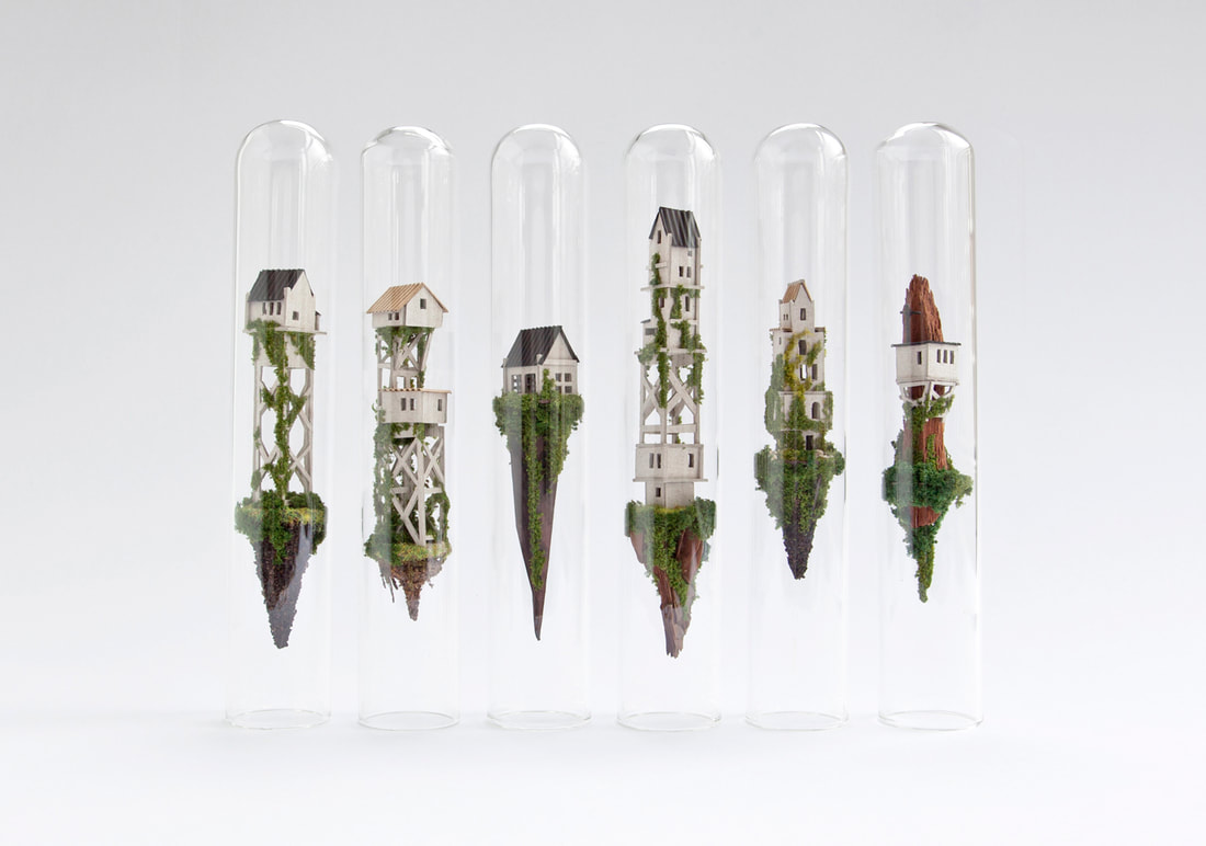
Rosa de Jong is a Amsterdam based designer and art director. Her creations are micro homes built inside test tubes and planes of glass. She uses fake moss and modeling trees to spruce up the sides of her cork cliffs. Her newest works, which are suspended between to pieces of glass are especially cool because the owner can move the pieces position in the glass. You can see more of her work here; https://www.behance.net/byrosa.
Her work is very interesting to me, it makes me curious to know how she made such intricate tiny pieces. Imagining the little families living inside the homes atop the cliffs makes the piece come alive. Rosa’s art opens my eyes to the idea that art can be so much more than pencil on paper. It makes me excited to try working with other materials.
Her work is very interesting to me, it makes me curious to know how she made such intricate tiny pieces. Imagining the little families living inside the homes atop the cliffs makes the piece come alive. Rosa’s art opens my eyes to the idea that art can be so much more than pencil on paper. It makes me excited to try working with other materials.
Drawing Unit
- Composition- The placing of visual elements in a work of art.
- Value- Defines the light and darks in an artwork.
Pros and Cons:
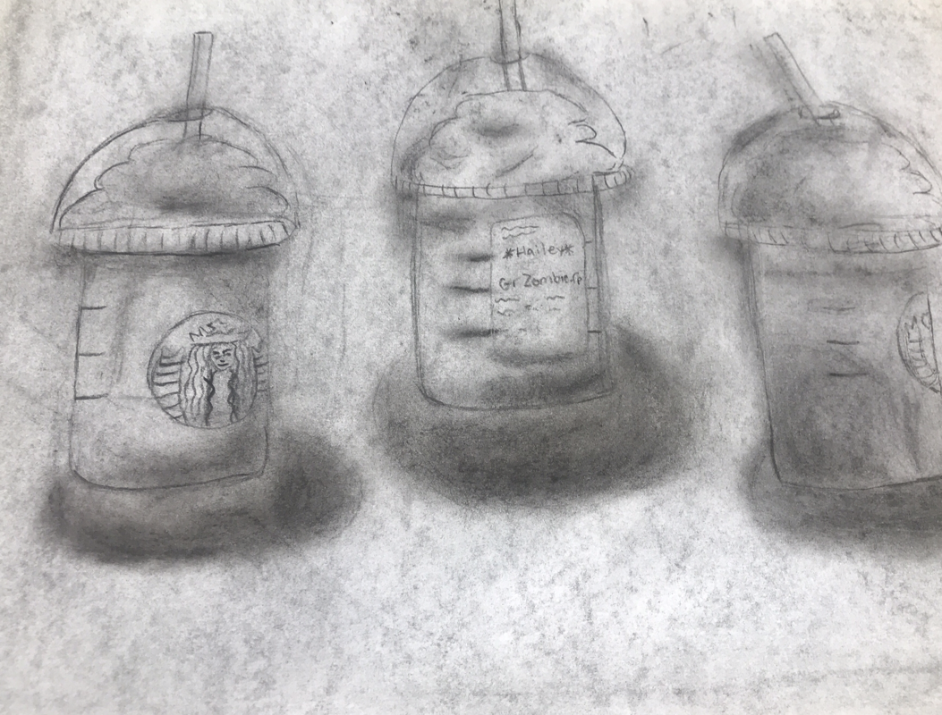
My least favorite of the materials was pencil. It was a lot harder to shade with and ended up looking pretty strange. A pro for the pencil though is the fact that theirs more control with a pencil. It’s easier to make small designs and write anything with the pencil.
Next was the charcoal which I enjoyed more. It was a lot easier to shade with the charcoal even though it was messier. It was also fun to get to use my hands to draw it made it feel more in my control. A con for the charcoal was how long it could take to blend sometimes. I would always get lines that wouldn’t blend in which was tricky.
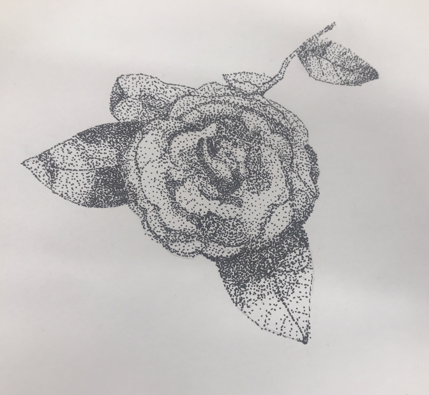
Last was the pen drawing which I enjoyed making the most. I really liked doing the stippling design I think it worked the best for the shading. It also was really easy to fix any mistakes I made. One con of the pen was there’s no ability to erase so I had to be pretty careful to stay in the lines.
My least favorite of the materials was pencil. It was a lot harder to shade with and ended up looking pretty strange. A pro for the pencil though is the fact that theirs more control with a pencil. It’s easier to make small designs and write anything with the pencil.
Next was the charcoal which I enjoyed more. It was a lot easier to shade with the charcoal even though it was messier. It was also fun to get to use my hands to draw it made it feel more in my control. A con for the charcoal was how long it could take to blend sometimes. I would always get lines that wouldn’t blend in which was tricky.
Last was the pen drawing which I enjoyed making the most. I really liked doing the stippling design I think it worked the best for the shading. It also was really easy to fix any mistakes I made. One con of the pen was there’s no ability to erase so I had to be pretty careful to stay in the lines.
The most helpful warmup to me was the sphere warm up. It really helped to learn more about shading and how to use charcoal. It helped me think about where the shading and lighting would be on an object. It also was cool to work as a group to create it. It made me think about how to collaborate on art.
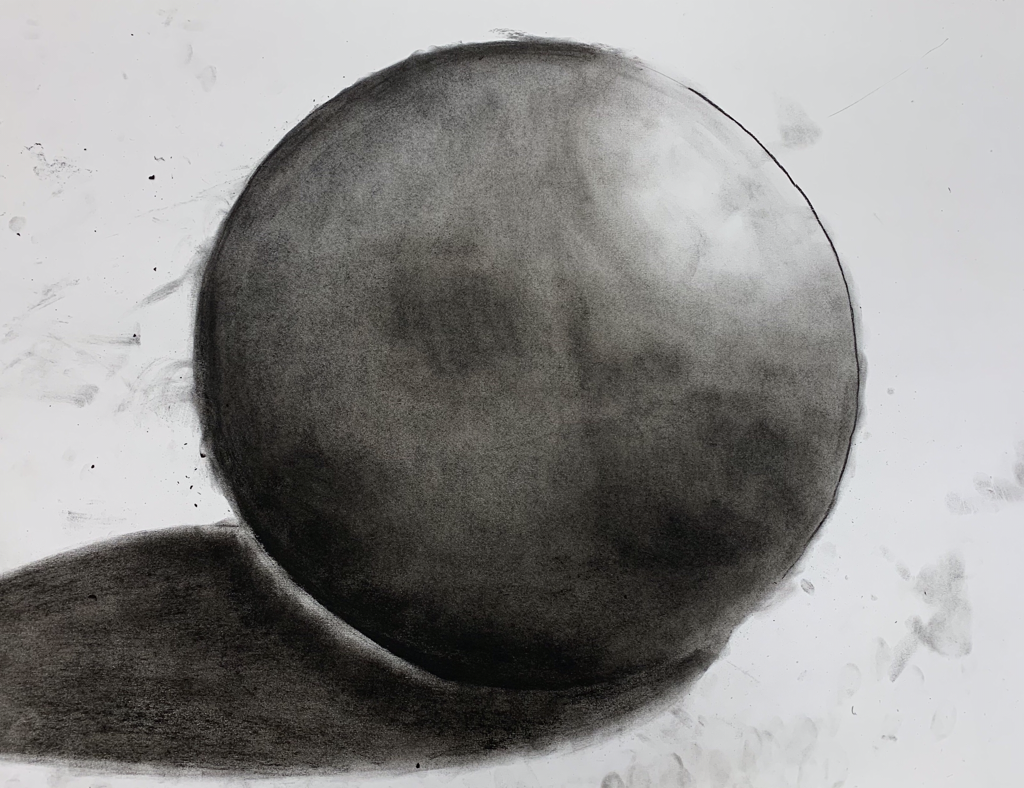
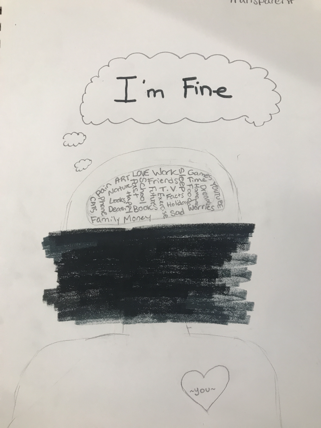
Illustration Friday- Transparent 9/20/19
Painting Warmups
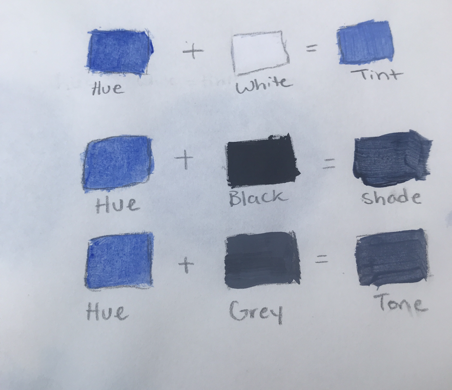
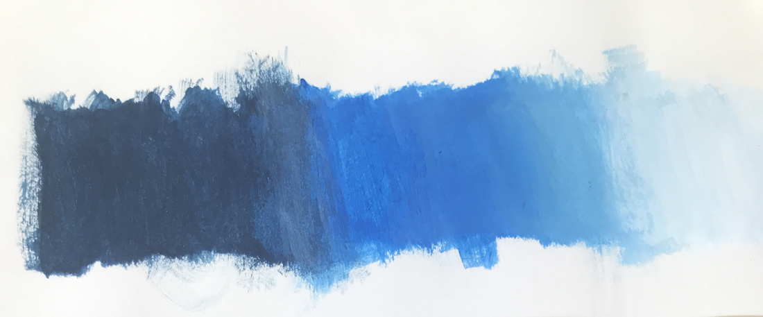
- Tint/Shade/Tone
- Gradient of color
- Color Matching
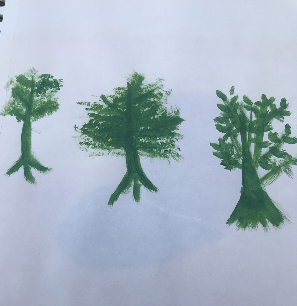
Practice Painting Trees
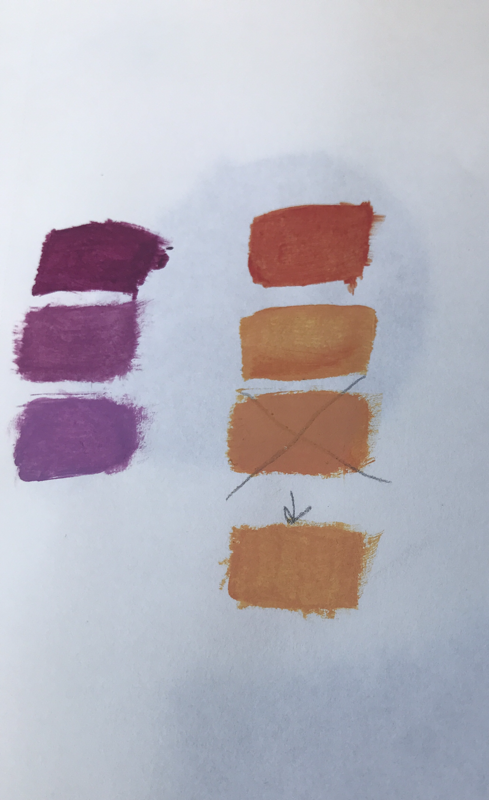
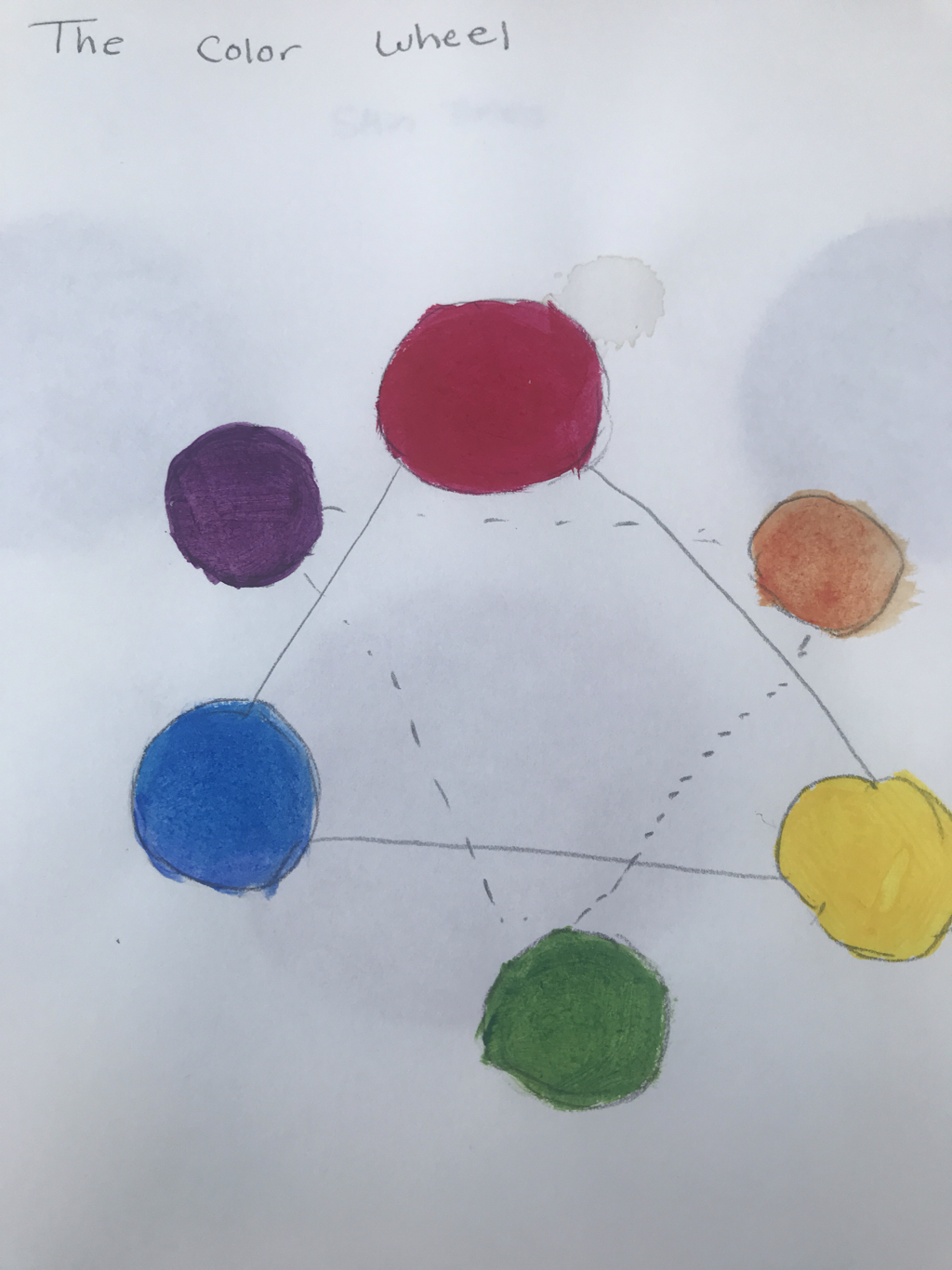
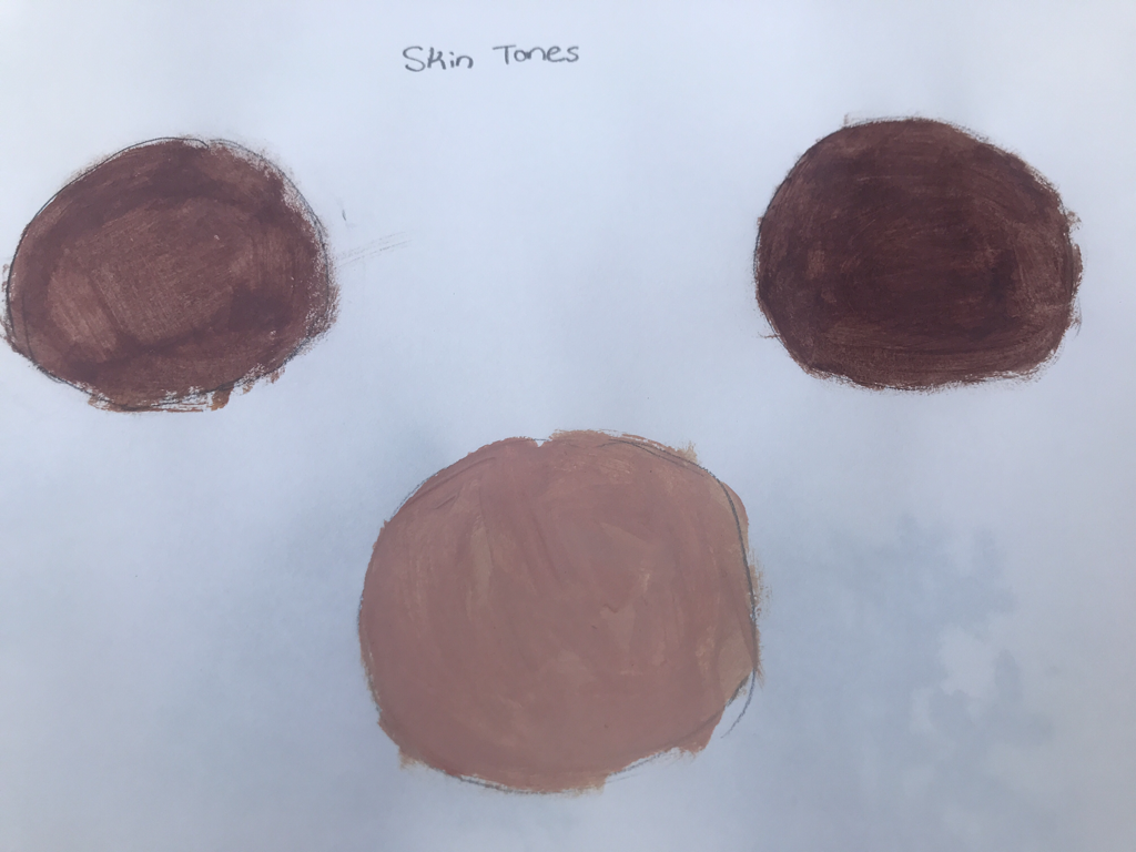
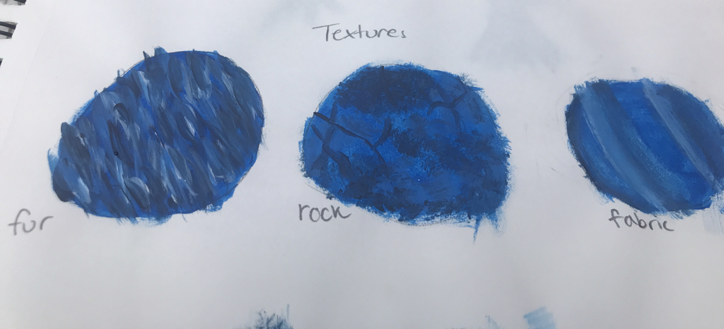
From these warmups I learned how to create different colors of paint from what we have. I also got to see the difference of using acrylics rather than watercolors. For my painting the color gradient seems like it will be the most helpful. The majority of my picture is sky which is a lot of gradients of the same color. The most helpful of these warm ups was the texture warmup. I never thought about how you would create those textures, so it really helped me out. To create the color brown you can mix and of the opposite colors on the color wheel such as red and green, yellow and purple, or blue and orange. To tone down a color mix a tiny bit of black.
The Idea of Place

Most helpful warm up
Painting in progress
Finished Painting
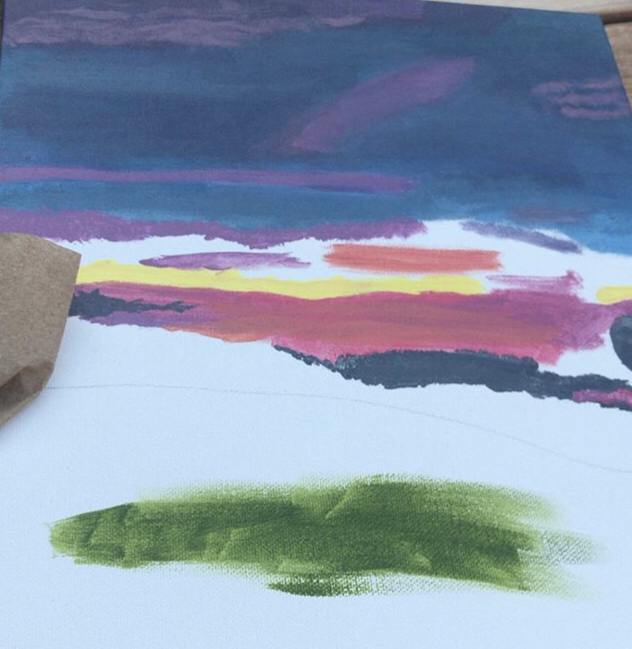
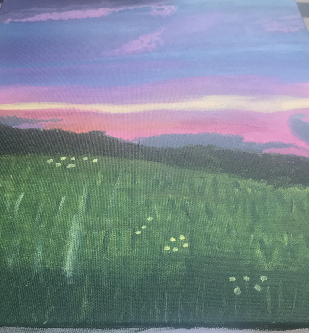
For this painting I chose a picture of a sunset I took while back home in Iowa. I was with my best friend at the time so it was a really special memory. Iowa is where I lived all my life and I love it very much, so that’s why I chose this picture to paint. The most challenging part of the painting was the ending of the sky where it turned to many different colors. It was really hard to match those colors and get them to blend correctly so it didn’t turn out so great. I think the grass was my favorite part to paint and I don’t mind how it turned out. My painting process started with penciling the outlines of the different sections like grass, tree line, and sky. Then I put down a base color for the sky and continued to add on different gradients of that color to create a ombré affect. I then did the tree line by adding a dark green color and adding some texture in with a lighter green. I went back in to add in more color to the sky before finishing with the grass. For the grass I put down a base of green and added in many other shades of green as well as lines for texture. Lastly I added some small yellow dots to try to show the flowers in the field.
Watercolor
Watercolor warmups:
1- Watercolor techniques page
2- Sunset
3- Illustration from a child’s book watercolor
4- Sketch of hallway
My favorite watercolor warmup we did was the children’s book illustration. It was really fun and challenging to recreate a cute image from one of the books. While watercolors aren’t my favorite I do like that you can blend easier and fix your mistakes. It’s a lot harder to create the right colors with watercolor though which limited my ability to add shading to my painting.
Watercolor Piece:
1- Piece in progress
2- Piece finished
3- Most helpful watercolor warmup
4- Most helpful perspective warmup
For my watercolor I did a one-point perspective picture of my cat; Tony. I took this picture of him sleeping on my lap at my house. For this piece I found shading and making different colors of brown hard. It was difficult to make things not seem flat with watercolor. The illustration watercolor warmup helped with how to create different colors and control the spread of the paint. The hallway warmup helped me think about how things size compare from different views.
Linocut Printmaking
My piece shows line through the kites tail and the clouds. I tried to vary the lines on the clouds to get some variety. I thought the idea for a kite was could have been pretty good, but I didn’t accomplish it. I didn’t cut the linoblock the right way so it kept cracking. I also didn’t know how to use the ink very well so I didn't get the gradients I wanted. Next time I will ask more questions so I can get it right.
1) Sketches
2) linoleum block
3) Finished print
1) Sketches
2) linoleum block
3) Finished print
Sign language letters A-G
Sculpture Vessel Project
Piece in progress
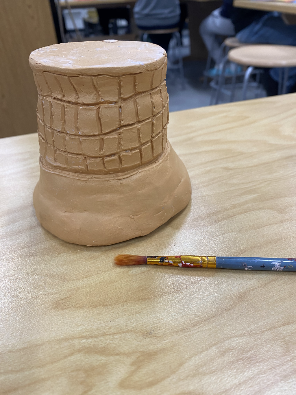
1- I plan to finish painting the inside of my piece with the tan paint I created. Then I’m going to glaze the top of my piece with pink, white, and brown to create neapolitan ice cream. I also need to figure out how to paint it in a way that will stick the pieces back together. Then I need to paint the cherry on the top of my piece at the very end.
2- Shaping the cone was really difficult for me, I had to recreate it multiple times. It was really hard to get the proportions to fit correctly because I kept making the ice cream to big.
3- I was successful in making my box stay closed, I can slide the top around and it won’t come off.
4- First I created a slab and shaped it into a cylinder and added a bottom by score and slip. Then I created a flat top with a piece of clay attached to the bottom to keep it from falling off. Then I created three mini pinch pots and connected them together to create the ice cream. Then I\] scored and slipped those to the flat top I made and put a tiny cherry on top. Then I put them in the kilm to be fired
1- Once my piece came out of the kilm I had to figure out a way to glaze some of the broken pieces back together. I used pink, white, and brown for the ice cream colors. Then I glazed the cherry on top red and put it back in the kilm to be fired together. I painted the cone with acrylic paint that I mixed together to make a tan.
2- I really like how shiny the ice cream turned out and it helped glue the pieces back together. I also like how the shape turned out, even though its a bit wonky I like it.
3- If I were to change anything I would work on the colors more. The pink didn't turn out very vibrant and the tan wasn’t necessarily the right shade.
Mixed Media Piece
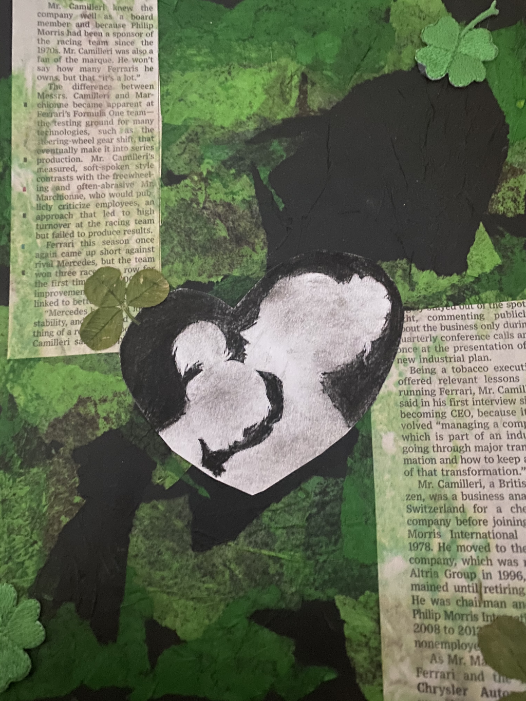
1- I used 7 different techniques. My first technique was using tissue paper and glue to create a base. Then I used news paper, that painted with a tan watercolor, and added it on top with glue. I also hot glued on four leaf clover patches. I also glued on real clover leafs that I found outside. Finally I found a picture of a mother and daughter online and printed it out on paper. I used charcoal to color the background and then glued it in the middle.
2- My word was future and I chose to portray it through my future daughter Clover.
2- My word was future and I chose to portray it through my future daughter Clover.
Portrait Warmups
1- The face proportions warmup was the most helpful for me. It helped me get a better picture of where the facial features are located in relation to the others.
2- The thing that surprised me doing the face proportions warm up was how small the eyes were in relation to the other features. The nose took up most of the face space and not the eyes like I thought.
2- The thing that surprised me doing the face proportions warm up was how small the eyes were in relation to the other features. The nose took up most of the face space and not the eyes like I thought.
Portrait Piece
In progress
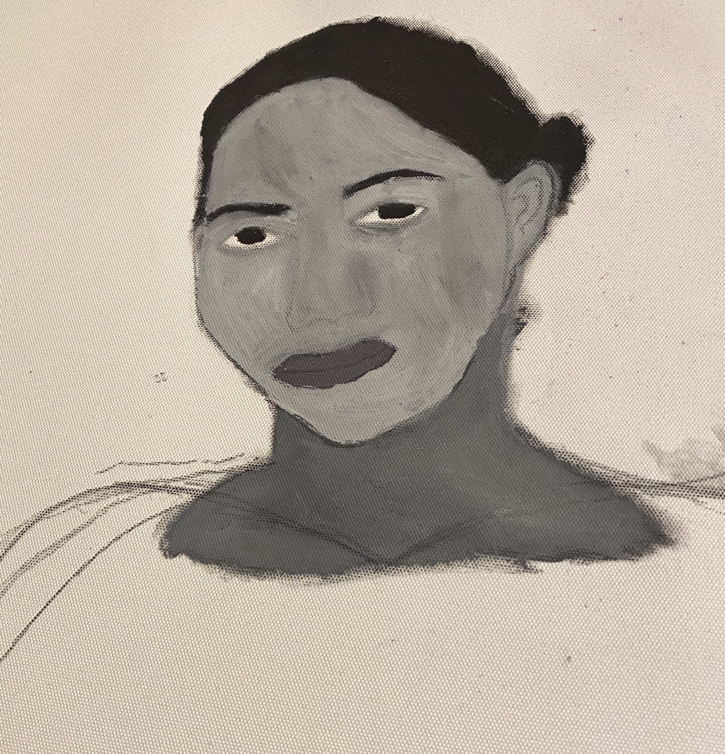
1- I did my piece of my best friend Dakota.
2- I used charcoal and acrylic paint to create my piece.
3- To start I picked my favorite picture of Dakota and traced it onto the canvas paper. Then I started by choosing a skin color, her real skin color was hard to create so I decided to do black and white. Then I drew on a shirt and painted it green and the background a dark purple.
4- I like the dark aesthetic the painting ended up having. If I could redo my piece I would use a different medium that would be easier for me to get a accurate image of Dakota.
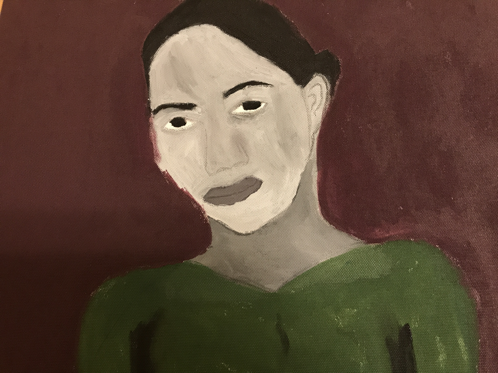
Finished piece
Final Creative Piece
1)What did I do well? I think I did well with the pairings of the pictures and my use of washi tape.
2) What could I do better? I could’ve figured out a better way to organize things in the scrapbook so there weren’t as many empty spaces.
3) To start out I went and bought a bunch of supplies from AC. MOORE like washi tape, a scrapbook, scrapbook paper and printed out my favorite pictures. Then I assigned the pictures to each piece of scrapbook paper and started decorating each page.
Final Exam
Section One:
1) What is the Art Criticism Process?
1- Describe the artwork: What does it look like, what colors and elements does it use.
2- Analyze the artwork: List the elements of the piece; color, value, line, shape, texture, and balance.
3- Interpret the artwork: What is the mood? What feelings and ideas are represented?
4- Judge the artwork: What do you think about the artwork? Is it successful?
Section Two:
For my critique I will be doing my mixed media piece, which was my favorite piece I made this semester. It is a board with dark green and black tissue glued down to it. I also added more details on top to go with my theme of future. First to kind of start of my piece I printed out a picture of a mother and daughter which was going to represent future to me. I colored in the background with black charcoal and glued it to the middle of my piece. There are real clovers and patches of clovers that I hot glued on top to add some texture. I put them in different corners to balance the piece out as well. I also added news paper strips in the corners which I painted with tan watercolor to give it a old aesthetic. Overall the mood of my piece is dreamy optimistic. Though the colors are pretty dark which make the piece seem more gloomy. It represents my feelings of love and hope for having a daughter in the future who I want to name Clover. I think this piece was one of my most successful pieces because it was the one I had the most enthusiasm for. I could’ve added more to the background but I also didn't want to make it to busy.
Three Additional Questions:
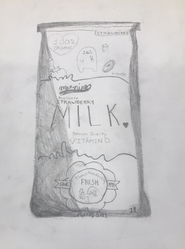
8) The warmup that I learned the most from was the skeleton drawing, the one where we had to sketch in the skeleton of a character we printed out. (Image 1)
11) A piece that I have a personal connection with was my acrylic painting. It is a picture of a sunset back home in Ames, Iowa. I took it when I was back visiting there and was out with my best friend. (Image 2)
16) If I were to redo a piece I would redo my watercolor piece. It really wasn’t very successful and didn't turn out the way I wanted it to. I would choose a different, easier picture to start out with and take my time with the watercolor so that it turns out better. (Image 3 is the piece I would redo)
